The New A-League Logo is Another Example of Why I Absolutely Hate Minimalism
DYOR Dave

This week, the gargantuan of the Australian Sporting scene that is the A-League announced a new logo. Change is always met with some backlash, but in this instance, the A-League has made it all too easy for critics to blast the new design, with a plagiarised and tasteless logo that looks more at home in a tech start-up than it does in a sporting league.
To start with the glaringly obvious, the logo is a blatant copy of Adelaide Building Consulting’s logo, which was soon realised by sports and construction fans around the nation. While they do have grounds for pursuing legal action, the consulting company seems to have taken it lightly, changing their logos on social media to replicate that of the A League’s. Managing director Timothy Rogers has said he thinks the designs are “essentially the same,” but is still unsure what the company will do about it.
While this embarrassing oversight has caused much media attention and criticism directed towards the league, there’s something about this design change that irks me far more than plagiarism and a lack of due diligence. For several years now, companies led by tech giants have been progressively moving their logos towards minimalist designs, and I hate it. Instead of moving with rapidly advancing modern technology to create intricate and mind-blowing designs, companies have opted to take details away from their imagery, leaving the public with nothing but soft, bland and simple logos.
There are a few reasons for this movement, with many of them contributing to the ultimate result of this transition, more effective brainwashing. Having studied a few PR and marketing subjects at uni, I have come to realise that the entire industry is based around trying to get people to think what you want them to think without them knowing, otherwise known as, brainwashing. Basically, it all boils down to ‘the less complicated things are, the more they will stick in peoples memory, so minimalist designs are perfect for this.
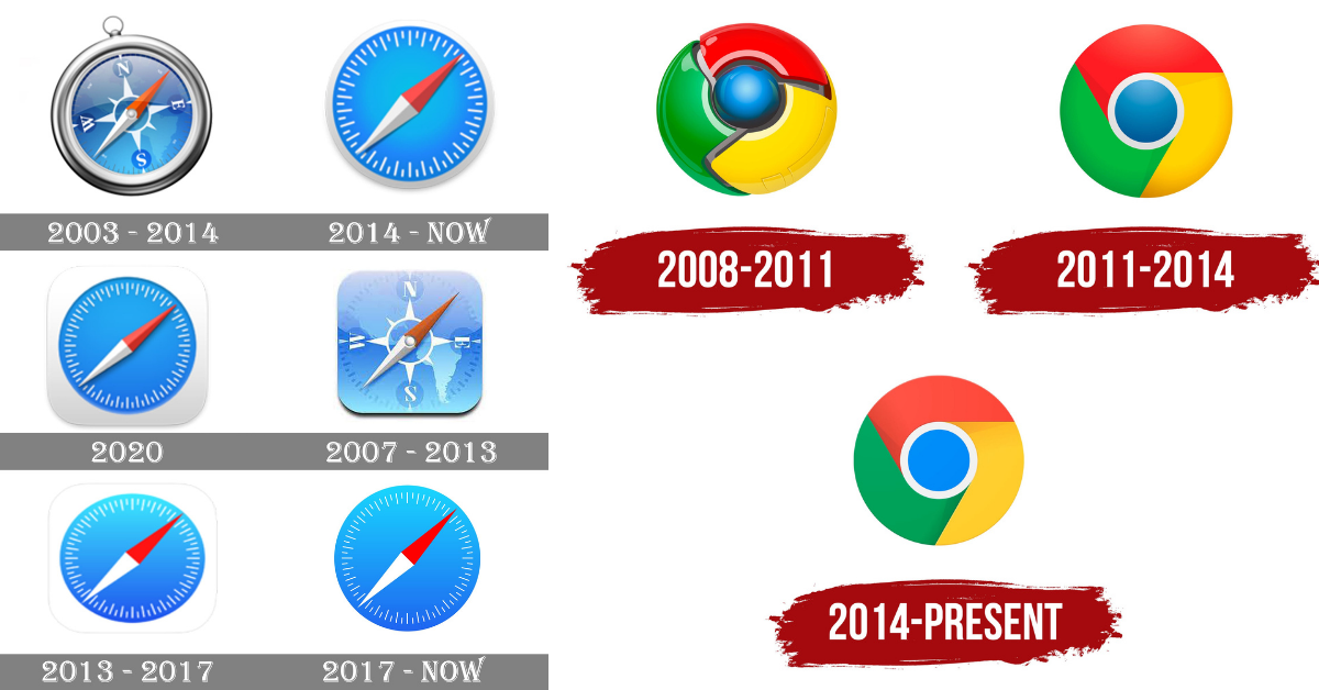
We’ve seen companies like Apple, Google, Facebook and Firefox incrementally fall into this trap, leading the way for smaller brands to follow. According to the science, fewer details and more empty spaces are a more effective way to grab the attention of consumers, and a more timeless (boring) logo will require less maintenance and updates as fashion trends come and go.
It’s like if you started wearing a plain white T-shirt and black pants every day for your entire life. You would never look out of style, and in a colourful world, your distinctive look would make you instantly memorable. This may sound great in theory, but fuck! How boring would it be to never get dressed up in a colourful party shirt for a Sunday session, or wear your team’s footy jerseys? Hell, imagine if every NRL team ditched their jersey designs in favour of flat colours, there would be riots!
While I won’t go as far as to say that corporate culture is slowly sucking all the fun out of reality and existence (not in this article at least), I still get a fiery rage within me every time I see another company throw any thought of artistic creativeness out the window in favour of a formulaic soulless brand of PR design. It is for this reason and this reason alone that I will most likely not watch a single A-League game this season, apart from maybe the grand final if nothing else is on.
Fancy yourself as a bit of a writer? Got some unqualified opinion and unwavering bias you’d like to share with the world? Send it through to dyor@hellosport.com.au to be featured on the site


